Telling Tails
WHALE OF A TIME!
Friday, 07 June 2019 20:20
Scott Delucchi, SPCA Executive Director
Our logo is a bit of a mess and mystery. As far as anyone here knows, it was created for us sometime between 1989 and 1991. Prior to that, we had a typeface only logo, our SPCA letters spun in a groovy 1970s font. That should have gone out with feathered hair, pet rocks and disco, but it survived a decade past its “freshness” date.
A class of students possibly from Monterey Peninsula College took on our logo project either unsolicited or by invitation. Again, the history’s fuzzy. Each student in the class developed a concept and one was selected by our leadership or by a vote. Who knows? And that’s the logo we have and use today. Well, almost. Interestingly, this logo did not initially include our name. Oops.
Depending on how one looks at it, the logo could be seen as clever, confusing, cluttered or maybe a little of everything. Let’s begin with the whale, the logo’s featured star. And, that starts and ends with one simple question: why? We don’t save whales, we don’t find new homes for them and don’t write legislation that protects them. We like them and they are here, in Monterey Bay. Maybe that’s why they made the logo.
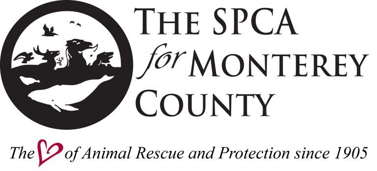
Next to the whale, you can see a seal or sea lion. Maybe the designer didn’t want the whale to be all alone (plus, the SPCA did care for seals and sea lions before the Marine Mammal Center formed).
Loneliness is not a problem for the animals above the surface. I see five mammals nestled like puzzle pieces, treading water, including a horse that resembles the Loch Ness Monster. Nessie is cleverly flanked by a cat and a steer in the negative space of the color. Or, one could say they’re uncleverly disguised. Rounding out the mammals are an adult deer and a dog tucked in at the far right, leading the buck, cat, Nessie, and steer to shore!
Above the swimming mammals, we have four birds. Let’s call them a raptor, a pelican, and two songbirds. We care for all three in our Wildlife Rehab Center.
Our logo features 11 animals, many with intricate details, like ID tags for the dog and cat and a spout for the whale. We get points for promoting responsible ownership and being anatomically correct, but details come at a price. Plus, this logo is an embroiderer’s nightmare!
Nike has a swoosh, McDonalds has golden arches and there’s the infamous apple silhouette with one byte. Simple logos are the most memorable and flexible; they look great on the side of a building and don’t lose much when produced much smaller on a business card or hat.
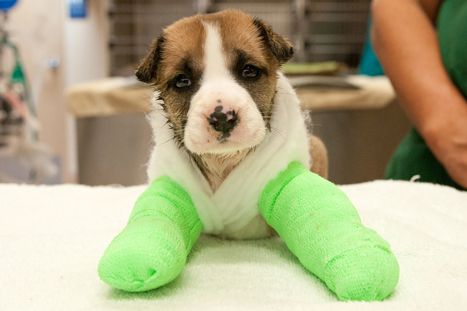
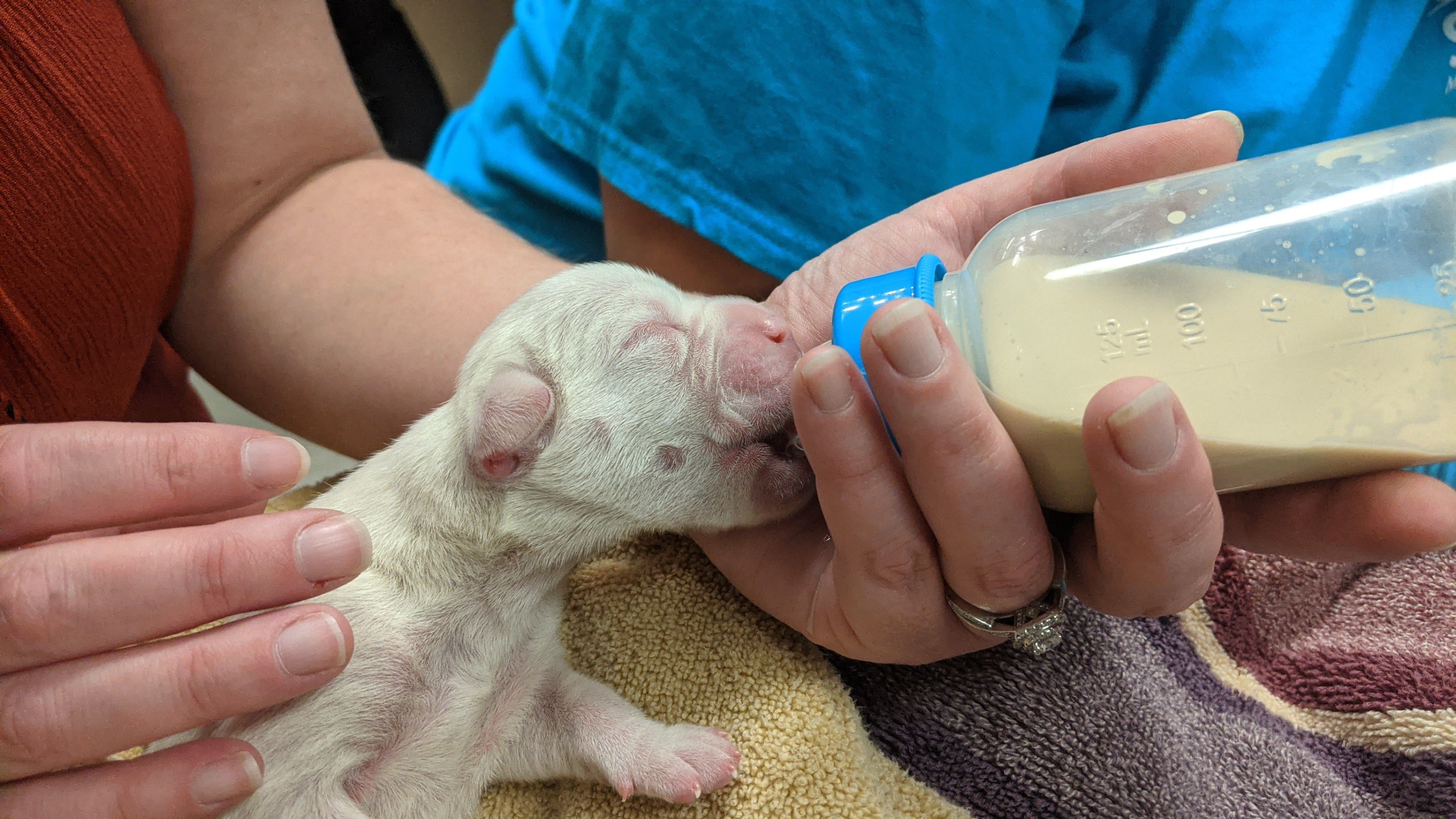
That brings us to our current challenge, or, as I like to say, an opportunity: a logo refresh. This would be a simpler project if we focused narrowly on dog and cat adoptions, like many shelters. We care for dogs and cats and other small domestic animals like rabbits, guinea pigs and hamsters. We care for horses (19 now!), chickens, ducks, geese, sheep, goats and pigs. Our residents include reptiles and pet birds. Finally, we operate a full scale rehabilitation center for all of Monterey County’s sick, injured and orphaned wildlife. We have more than 100 in care today, including barn owl chicks, a young coyote, baby raccoons, and a few dozen songbirds.
Our goal for domestic animals is to rehome them; for wildlife, it’s to make them well enough to be released. But, these are far from our only programs and functions. We operate a low-cost spay/neuter clinic and a humane education department; our Animal Camp program for kids begins next week and lasts all summer. We respond to calls related to animal abuse and cruelty (900-1,000 every year!) and we offer a number of dog training classes and one-on-one consultations.
How do we give even some sense of this in a logo? Stay tuned. I can guarantee the new look will not have a whale, Nessie or pet rock. If it gives people a sense of our scope while remaining simple and conveys warmth and compassion, we’ve done our job.